Feeds:
Posts
Comments

Posts Tagged ‘usability’

And after a few weeks of not quite knowing, it all fell into place a couple of weeks ago: I knew what I was going to do.

Up until then, there was a vague idea, and a vague explanation. Now, it’s all so crystal clear. And that feels good!

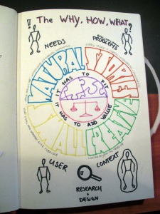
This is what it is. I used the WHY, HOW, WHAT principle as was explained by Simon Sinek at a TedTalk. Watch it, it is pretty inspiring!

My WHY:

CONGRUENCY: I believe in the feeling that things fall into place. They feel right. They are supposed to be like this. Whether it’s quitting your job to start up your own company, finding a solution to a design problem or using a product for a specific purpose. All that should be congruent with everything else that is part of reality at that moment.
VALUE: I believe that everything I do should have value. I try to only do things that I think are valuable to me, the world and other people in the world.

My HOW:

NATURAL: I do this by turning things into something natural. Use of a product should be intuitive, easy, unobtrusive, effortless and supportive of the goals.
STORIES: I do this by listening to stories of real people. Every story is worth listening to, and is of value because you can learn from it. Feeling connected to others adds value to the process.
CREATIVE:I do this by being creative, by looking beyond the problem at hand and finding the solution beyond the ones that already exist.
SMALL: I do this by starting small and then spreading. I believe in an agile, flexible process that fits with what is really needed at that point in time. Doing lots of little things at a time and adjusting them has more value than doing one bulk of work with the possibility of getting it wrong. Without losing the overview of what is really important.

My WHAT:

USERS: I look at users
SITUATION: I look at the situation the user is in
NEEDS: I look at user’s needs, even the ones they don’t know they have
PROBLEMS: And then I solve problems to make things easier.
SPECIFIC: I do this for specific situations and target groups.

(I can hear you all ask: of WHAT exactly? I’m working on getting that clear right now)

I call myself the user’s advocate.

Pleased to meet you.
Read Full Post »

I went to the Waarmaakdag the other day. Which roughly translates to ‘Making things happen day’. It was fabulous! It reminded me of how much I want to do this whole setting-up-your-own-business thing and of all the people in that world that I want to learn from and be part of.

There were experts on all kinds of different fields. A guy I already knew gave me a kick in the butt to go record my very own elevator pitch, so here it is! (in Dutch)

Elevator pitch of my very own company which does not have a name yet

Read Full Post »

Well… except if it’s for a good reason, but I haven’t been in a situation yet where anyone could convince me of a good enough reason. Let me explain. No, wait. Let someone else explain (who’s better at explaining it than I am)

This guy manages to say in 1:48 minutes what I’ve been preaching for the past 2 years. Go and listen to him!

Podcast by Boagworld about why more features are not the same as a better product.

Some background for you:

Paul Boag is a guy I follow on Twitter and I like his blogposts a lot. They’re inspiring, funny, insightful and very true. I share most of his opinions. He blogs about the webdesign world, including usability and design. Check him out at http://boagworld.com

Read Full Post »

I’m no good at drawing. But, as with other things, I’m learning not to mind that, which helped me in my latest project at work.

I’m also a big fan of Infographics. If you’re not familiar with this way of conveying information, you’re in for a treat! I think they make things understandable, simple, fun and memorable. Things that are always important when you’re trying to get your information across.

At my work at InTAAL, we’re making a new product. I always start with a product vision (what should it do, what do we take into account, what’s our opinion on how it should work and for whom, what’s the basic idea that will make it different from similar products, etc. Don’t worry, I probably will do a blog post on design visions someday.) I could not get into the flow and started making my own design vision infographic. It’s not very slick, but I had fun doing it and it felt very useful. Now we have something to point at, something to keep in our minds while designing the product and something that we can communicate to other people. I’m pretty happy with the result. Tell me what you think!

An infographic is basically one huge poster. The difference with a poster is, that it actually has more than only an invitation. It strives to contain all the information you need on one subject. It makes use of all the graphical trickery you can imagine, which help you understand the information better.

The trick of making a good infographic is to use your space and also very much the size of the things you put on it. Things that need to be noticed first have to be HUGE (such as the subject of the infographic). Things like explanations or further details can be small. Futhermore, you can go wild on all the other graphical tricks you can find, like flow diagrams, maps and icons. There are a lot of pictures and drawings in there, since we are all convinced that a pictures says more than a thousand words. It’s a big challenge to put everything you want to say on one sheet of paper, but it’s a good (although very different) process of organizing data. It also allows you to put more information in there than you’d initially think possible. Some people are very creative when it comes down to presenting information visually, which goes from the flag of the United States turning into a stock market graph to the height of buildings indicating how many people live in a city (just google on infographic images and you’ll find more examples).

I think these are so great because making one forces you to think about the levels of information you have. It forces you to be concise (something I have to practice) and play with your information. You guide your reader through all the different levels you provide them and if you did it well, you just made your reader a discovery through the subject of the infographic. It makes learning about things fun. It makes writing about things fun. The creativity part is undeniable. And they just simply look better than a bunch of words sitting in a Word-document (no matter how well written and how well organized the document is).

Here are some great examples of infographics that I came across:

infographic User Centred Design (a must see for all of you who want to know what I do for a living and what my company will be all about! And a very good infographic which makes use of all its benefits)

infographic about a hangover (make it smaller by hitting Ctrl + – for a couple of times and notice the different levels you see. First you notice the guy and the title, then you might notice the arrows and then you might start reading letters)

Inception infographic (it can be about anything!)

infographic about smoking (amazing how much information you can put in one of these things!)

infographic about cheap and good wines (I like the way they make the subject clear immediately. The reader does not have to do any effort to understand it’s about wine.)

Read Full Post »

Other people may think usability is about the buttons. But really, it’s about looking beyond the buttons.

Usability is about making things easier to use for people. Whenever I tell someone I’m a usability expert, they say: “Oh, I need you! It’s all far too complicated!” If a user feels like that, us usability experts get to do something about it. This in itself is not very complicated. It’s just using your common sense. But before using your common sense, you need to have the ability to observe the world surrounding you.

I sometimes feel like I’m preaching. What I learned about usability and doing research is sometimes hard to explain. People are used to listening to what a customer wants and then building it. They’re not very used (yet!) to thinking about what the user wants. And sometimes, the customer and the user are not the same person. If they do want to know what the user wants, they’re only willing to think about it, instead of putting some time (doesn’t have to be much) and effort (again, not much) in actually seeing what goes wrong, so you have a solid base for the decisions you have to make when designing the product. This solid base is very much needed if you want to end up with a good and easy to use product.

Usability is about solving problems for users. But before you can do that, you have to understand which problem they’re having. Most of the time, you think you should solve one problem, but if you really think about it, there an underlying problem that, if solved, magically makes everything better. And don’t be surprised if, beyond that problem, there’s yet another one.

In short, usability is about looking beyond the problem, by scrutinizing use in its context. It might just turn out that you don’t need those buttons at all!

The following article grasps most of the notions I always try to get across. It’s an interesting article (thank you, boagworld!).

Usability for handheld devices versus computers

My own summary:

– Look at REAL users of the product
– Look at real use of the product
– Be in the context of the use (of the real users)
– Don’t only ask questions. Observing is more insightful.

Read Full Post »